
FROM THE EXCEED IT BLOG
Modern App Design Patterns: How to Choose What Helps Your Users
Published
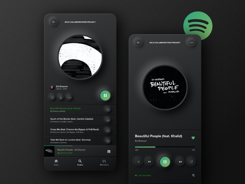
Modern design should make a product feel understandable and considered. A visual pattern earns its place when it improves a real task. This article updates our earlier 2023 design-trend roundup with questions a business can use when reviewing proposed app designs.
Ask what a pattern is meant to improve
Before approving a fashionable treatment, describe the user problem it addresses. A compact dashboard might help a dispatcher identify overdue jobs. A large animated welcome sequence may add delay for someone opening the app repeatedly during a shift.
Judge a proposal with realistic content and the expected device. Attractive demonstration screens often contain short names, perfect images and very few records. Your application may need long addresses, missing photographs and hundreds of outstanding tasks.
Keep minimalism informative
Removing clutter is useful; removing the clues people need is not. A borderless icon may look elegant while leaving users unsure whether it is a button. A form still needs clear labels, required-field information and understandable validation.
Use hierarchy to organise complexity instead of pretending it does not exist. Show the essential decision first, then make supporting detail available. For an invoice approval, the amount, supplier and action may be prominent while the audit history remains one clear step away.
Make motion explain a change
Animation can connect an action with its result, such as a saved item appearing in a list. It should not become the only confirmation or block repeated work. Provide a stable final state and account for people who prefer reduced motion.
Test slower devices and lengthy lists. A transition that looks smooth in a presentation may compete with data loading in the actual app. Agree which animations are essential to comprehension and which are optional decoration.
Treat dark themes, voice and immersive features separately
A dark theme is a preference that requires its own contrast and asset checks. It is not automatically better for every person or setting. Offer it where appropriate and preserve clear status feedback across themes.
Voice input can help certain tasks but needs a plan for background noise, corrections and private information. Augmented reality needs relevant content and device testing. Neither should be included simply because another product uses it. A conventional form may be more suitable for precise, reviewable business records.
Prototype the uncertain part
If a proposed AI conversation replaces a familiar workflow, test whether users can still understand what has been saved, changed or approved. Keep a clear route for reviewing the result and correcting mistakes. See our business AI assistant guide for a bounded starting point.
Compare two approaches using the same task and information. Record completion, errors and hesitation rather than asking only which version looks nicer. A short software pilot can establish whether a design decision helps everyday work before it is applied across the entire product.