
FROM THE EXCEED IT BLOG
Mobile App Design: Turn a Business Workflow into a Clear User Journey
Published
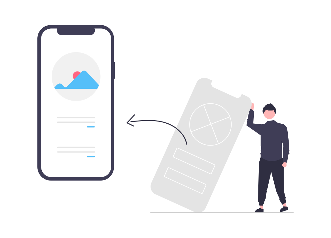
Mobile app design connects a business process to the decisions a user makes on a small screen. Colour and typography matter, but they cannot compensate for an unclear task or a missing step. Start with what the person needs to accomplish and design the interface around that journey.
Map the journey before polishing screens
Identify the entry point, required information, main action and confirmation. For a booking app, the user may choose a service, find an available time, review the details and receive a confirmed result. Each step should explain what is happening and what remains to be done.
Include the staff journey. A customer request may require an approval or correction behind the scenes. If staff cannot operate that process, a polished customer screen will not make the service dependable.
Use wireframes to resolve structure
Early wireframes help discuss content, order and navigation without making every detail look finished. Use realistic labels and example information so stakeholders can judge the actual task.
Avoid reviewing only empty or ideal screens. Show a long customer name, a full list, missing information and a difficult choice. These examples reveal layout and content problems before they become expensive implementation changes.
Prototype the decisions that are uncertain
A prototype should answer a question. Can a customer understand the booking state? Can a technician complete the form with minimal typing? Can a manager distinguish an approval from an acknowledgement?
Observe representative users rather than explaining every step while they click. Their hesitation provides useful evidence. Record the problem and adjust the flow before spending time on visual polish.
Design all important states
A complete interface includes loading, empty, success, validation and failure states. Explain what the user can do when an action is unavailable. Preserve their work when a recoverable error occurs.
For example, an interrupted photo upload should not erase a completed checklist. The offline-first guide shows how these states connect to the underlying system behaviour.
Make the visual system readable and consistent
Use clear hierarchy, sufficient contrast, meaningful labels and controls large enough for the intended interaction. Do not rely on colour alone to communicate status. Test larger text and keyboard or assistive navigation where relevant.
The W3C accessibility reference provides useful criteria for applicable interface checks. Platform-specific conventions also matter; consistency does not require every platform to behave identically.
Carry design decisions into acceptance
Document the behaviour that the prototype established, including exceptions. Review the implemented product using the same tasks. A visually similar build can still behave differently in a way that affects users.
Read our acceptance-testing Insight, mobile UX article and mobile development service to connect design work to a usable release.